KATIE BERLIN
SERVICES RENDERED
+ brand identity
katie berlin has found her passion in yoga, it is a fundamental in her daily life and empowers others to better their lives through her leadership. katie came to me to create a brand identity that would be for both her yoga instruction and also for the apparel line that she is currently developing. a brand identity helps to shape the character of a business, but it should also embody characteristics of those who are making the business what it is. i have known katie for a long time and she is sophisticated, innovative, and elegantly tenacious.
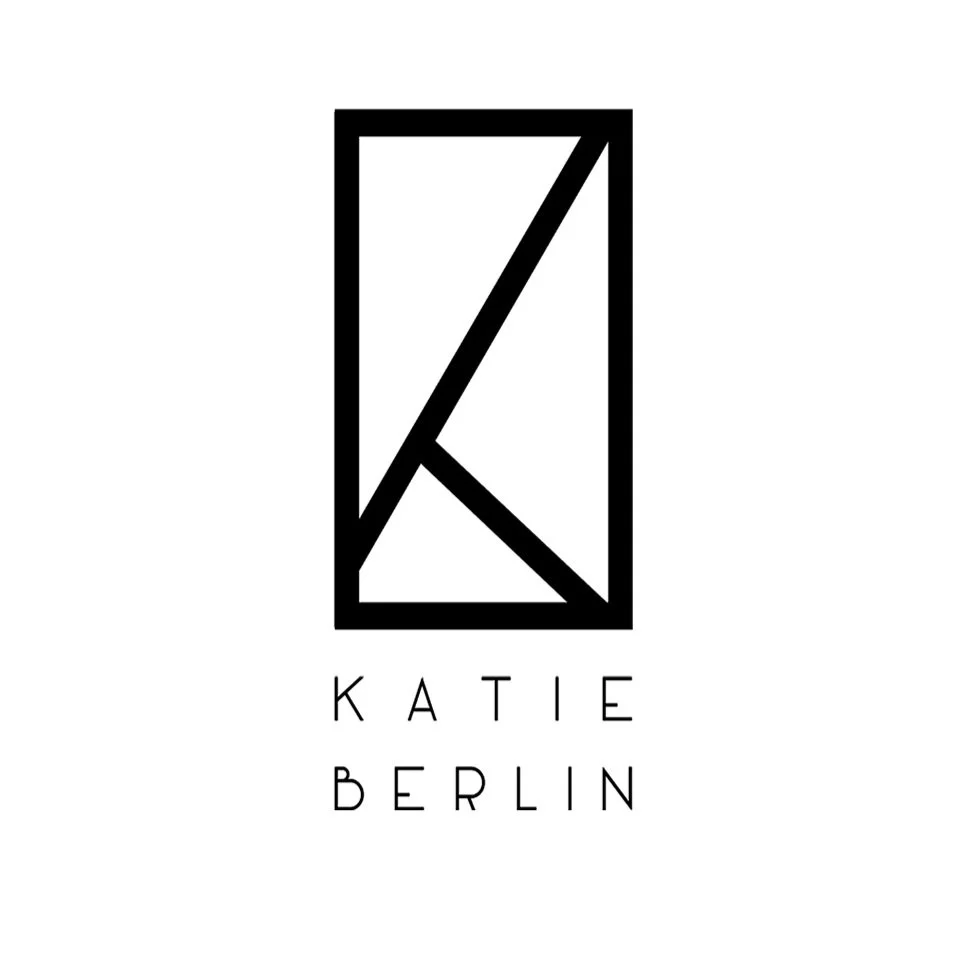
in her brand identity, we were going for something that is modern, sophisticated, and edgy with a bit of a classic element as well. katie's manifesto is "where the physical meets the metaphysical" and the concept of balance is conveyed through this concept in all aspects of our being. in the identity you'll find that there is the obvious "k" for her name, a yoga pose, there are geometric shapes representing crystals which is a foundation of her apparel line, and you find the golden mean in the lines formed. the golden mean is a representation of balance and has been described by mathematician and philosopher, adolf zeising as "the ground-principle of all formative striving for beauty and completeness in the realms of both nature and art, and which permeates, as a paramount spiritual ideal, all structures, forms and proportions, whether cosmic or individual, organic or inorganic, acoustic or optical; which finds its fullest realization, however, in the human form." this concept of the golden mean aligns with the foundation katie is basing her business model on.

